Tuesday 30 September 2014

Film Noir

Film Noir

Film Noir (literally 'black film or cinema') was coined by French film critics (first by Nino Frank in 1946) who noticed the trend of how 'dark', downbeat and black the looks and themes were of many American crime and detective films released in France to theaters following the war, such as The Maltese Falcon (1941), Murder, My Sweet (1944), Double Indemnity (1944), The Woman in the Window (1944), and Laura (1944). A wide range of films reflected the resultant tensions and insecurities of the time period, and counter-balanced the optimism of Hollywood's musicals and comedies. Fear, mistrust, bleakness, loss of innocence, despair and paranoia are readily evident in noir, reflecting the 'chilly' Cold War period when the threat of nuclear annihilation was ever-present. The criminal, violent, misogynistic, hard-boiled, or greedy perspectives of anti-heroes in film noir were a metaphoric symptom of society's evils, with a strong undercurrent of moral conflict, purposelessness and sense of injustice. There were rarely happy or optimistic endings in noirs.


Lighting


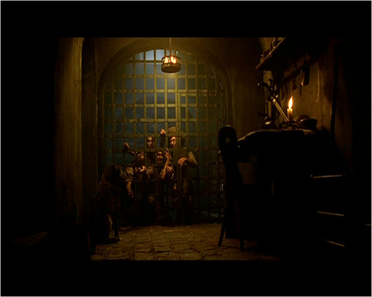
The lighting used in this image is low key lighting as it produces strong contrasts of light and dark and creates dramatic shadows. It uses under lighting as it shows the light coming from below the subject leading to a distorted effect. The effects that are created are very visible, as you can see how thick the flame is and how it covers up most of the image. Also the smoke has got lots of bright white light on it, and there a bright light on the left side of her face making her look like a villain


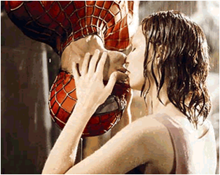
The lighting used in this image is also low key lighting its created by using only the key and back lights. This effect produces strong contrasts of light and dark and creates dramatic shadows. The effect is known as chiaroscuro. The use of low key lighting makes the character look mysterious, as there is only a bright light shining upwards to her, where we are able to see her facial expressions and her eye contact. It also allows us to see her posture. This image also uses top lighting which is used to accentuate the features making her look glamorous.


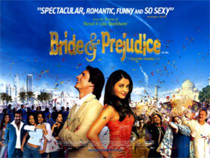
The lighting in this image is high key lighting, means that more filler lights are used. The effect appears more realistic and might depict either a sunny day or a more dimly lit scene. The major difference is that, although shadows are still created, the contrast between light and dark is much less pronounce. This image also uses top lighting, allowing us again to see the features of the character, and their facial expressions, the lighting also makes the character look glamorous


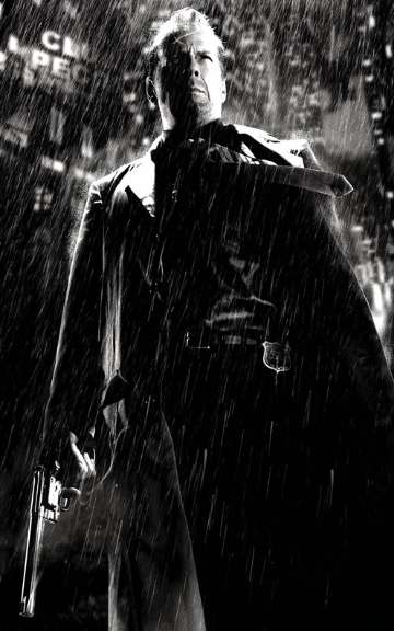
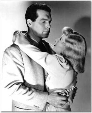
The lighting in this image is low key lighting, as you can clearly see his posture. As this image is a under shot, it makes the character look very powerful. The lighting used is a bright white light on the characters face, allowing us to see his facial expression, and his eye contact. There's also a slight light on his coat and on the gun, to signify his character, and to inform the audience that hes on a mission, Another lighting used is top lighting making the character look glamorous, and allowing us to see his features.


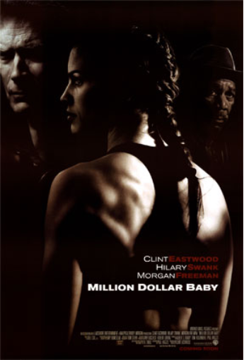
The lighting in this image is high key lighting, as the image appears to be more realistic, the light is used in the whole image, but mainly the background, The lighting allows us to see the characters facial expressions, her makeup and her posture, making her look glamorous. the character in this image is in black and white, yet we can still see the effect of the light on her, The image also shows shadows of the character. Another lighting used is back lighting is when the source comes from behind the object to create a silhouette.


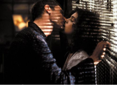
The lighting in this image is low key lighting, as it creates shadows on the characters faces, and we can see contrasting colours, which creates dramatic shadows. It creates strong contrasts of black and white. Another lighting used in this image is top lighting as it accentuates the characters features, and their facial expressions clearly.It also allows us to see the characters posture, but not as clearly. The lighting used states that its coming from outside through the blinds making it look effective.

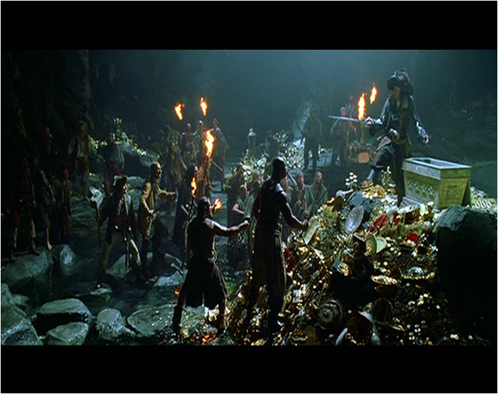
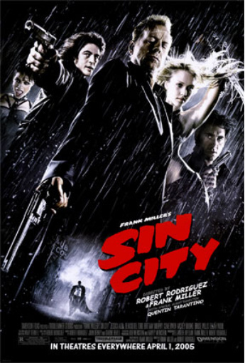
The lighting in this image is low key lighting, as the shadows shown are really solid, The shadows are shown clearly on the ground, it creates dramatic shadows. The strong contrast is also shown between light and dark in this image. Another type of lighting that is used is back lighting creating an silhouette. The lighting creates a strong impact on the characters as we can learn about them, they look like strong characters on a mission.


The lighting used in this image is high key lighting, as we can see more filler lights are being used, and there's a less contrast in colour, as there's a fair amount of both dark and light. The lighting comes from above allowing the audience to see their facial expressions, and their posture. The lighting makes the character look glamorous. In this lighting we are able to see the characters features clearly.


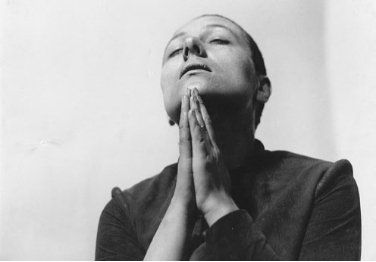
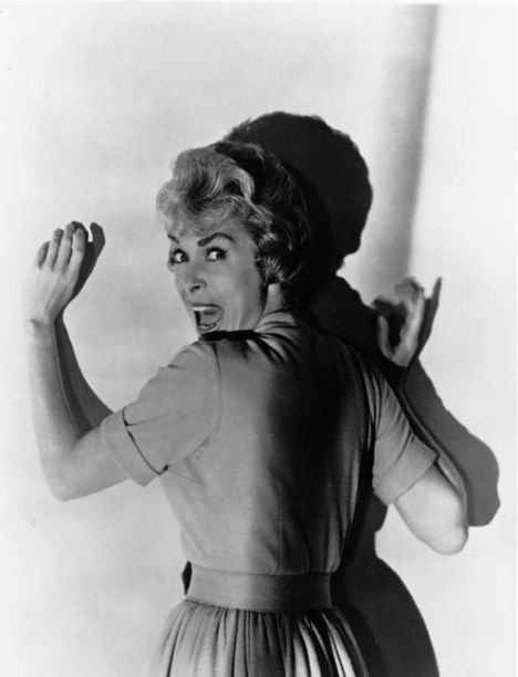
The lighting in this image is low key lighting, as the light is mainly focused on the character face, and her features. Its also focused on the background, The lighting creates a dramatic shadow effect on the wall, The lighting also allows us to see the characters facial expressions clearly as the light is mainly focused on her face. Top lighting is also used on this image which accentuates her features making her look more glamorous.


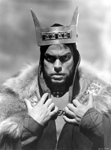
The lighting used in this image is clearly low key lighting, as we can clearly see the dramatic shadows, we can also see that the light is only used on the character, making the character look glamorous, this is called top lighting. The lighting in this image is used effectively as it creates a dramatic effect, allowing the reader to know its from a horror, or action movie, as less light is used in this image and the lighting used is focused on the character making him look like the villain.


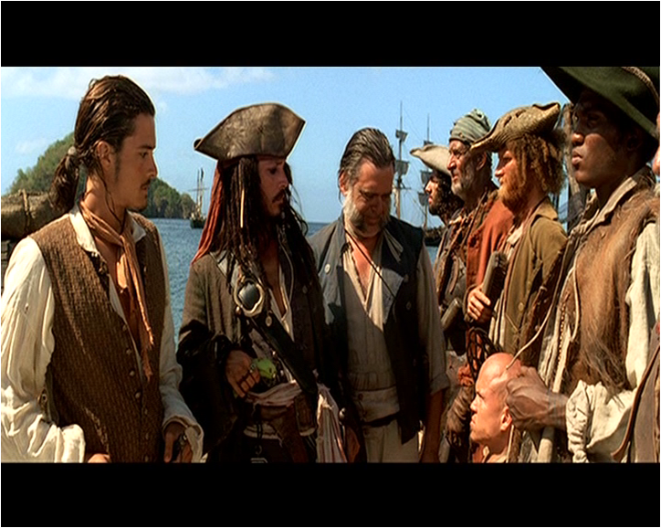
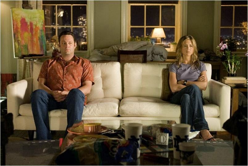
The lighting in this image is high key lighting, as we can see the characters facial expressions, and their postures clearly. The use of more filter lights makes the image look more realistic, we can see a slight shadow of the characters but not as much as the contrasts between light and dark is less pronounce. The lighting is used mainly on the left side of the image, and it tends to become darker on the right side, but not as dark. The lighting allows the audience to see what type of relationship they share as we can see their features clearly.


Friday 26 September 2014

Mis en scene - Still Images


Costume: the costume the characters are wearing are very different. In the first image the character is wearing a suit, making him look smart. In the second image the characters are wearing party clothes, the guy is wearing suit, and the girl is wearing casual clothes, making it look like they are going on a date or a party. In the last image the character is wearing a black costume, making him look like a monster, and a powerful character as black connotes power.

Actors: in the first image the character looks really clumsy, as he is pulling a funny face, this connotes that his character is mainly for humor films, the second image the actors are looking into each others eyes suggesting that they are in love and that they share a close bond, in the third image the character looks very angry he looks like the villain, the characters posture and his facial expressions show that hes going to destroy everything and that hes on a evil mission.

Make-Up: In the first image the character is wearing foundation to make himself look very pale and clumsy, hes wearing a very light pink lipstick. In the second image the characters again are wearing pale foundation, but they are not as pale, they look more orange/tanned, the girl looks like shes red maybe to show shes blushing at that moment, and it shows that she loves him. In the last imagine the character is wearing lots of pale foundation which makes him look like a evil monster, as his hair is all scruffy it shows that hes a wild 


Still Image


Costume: the costume the characters are wearing are formal and connote that they are present at a formal gathering or a party. The boy is wearing a suit, and the girl is wearing a dress.

Lighting: High key lighting which brings out the features of the characters making the current scene look more attractive and the actors look more glamorous. It also allows us to see the characters facial expressions, and their eye contact connoting their feelings and emotions. It also allows us to see the setting clearly

Actors:there are two actors in the scene, who are quite close to each other which suggests that they are in a relationship, the facial expressions of both characters look passionate about each other, and look deeply in love as they are looking into each others eyes. Also the girl has her hand on his shoulder suggesting that they are about to dance together.

Make-up: both characters are wearing foundation to make themselves look pale, and both have the same hair colour making them look attractive. The girl has curly fancy hair connoting that she has put in effort to get ready for this day to look attractive, whilst the boy has also done his hair.

Props: the props are the background lighting making it look like a party, it had little lamps across the setting to make it look like its based at night time, and its a special ball.

Setting: the setting is at a party or a ball as we can see them dressed smartly, and they look like they are about to dance together.


Thursday 18 September 2014

Mis En Scene


Mise en scene:  the setting of this imagine is in a very old house, which would link to when this picture was taken, as its really old. The positioning of the characters are behind a cage showing that they are isolated, they also look like creatures as they are reaching their hands out. The lighting in this image is used effectively as there's a beam of light coming from the top and the rest of the room is dark, this is used to highlight the characters in the middle, a focus light.


Mise en scene: the setting of this imagine is in a cave. The props in this image used looks like they are going to battle or planning a battle as they are all holding fire. The positioning of the characters are spread out in the cave, as there are many of them. The lighting in this image is low light, as there is a beam of light used in the center of the image to show and highlight the positioning of the characters.


Mis en scene: the setting of this image is at the sea, the positioning of the characters are really close, looking like they are discussing something important as a group. Their facial expressions look like they are all looking down at the four men and maybe judging them, The man in the middle looks like the leader due to his costume, and how hes dressed, hes wearing better clothing than the other men, The lighting in this image is really bright connoting the daylight of when this imagine was taken, a high beam of light

Dulux Advert


This Dulux advert uses a range of techniques to target a certain group of people, and to catch their attention. The colour in this advert used is mainly blue and white to emphasis a 'cool' and 'relaxed' mood, as blue connotes  often associated with depth and stability; whereas white is associated with light, goodness, innocence, purity, and virginity. The picture and text are framed in different  colours. For example the board is presented in dark blue, and the text is presented in white. This may connote back to what the colours symbolise as the reason to why the board is blue is to show the richness of the colour blue, and the white light upon the board highlights the fact that the richness in dulux pain also leaves the walls shining, making it look silky. This links to the text 'lets colour' as it gets the customers to realise how rich the paint is and the fun with dulux paint. this advert is targeted to mainly everyone who has a home and wants it refurbished to the best standard. The picture presented in this advert is of a person

Task - meanings&emotions


What meanings/emotions do the following images convey: 
the emotions and meaning portrayed are love. Their body language suggests that they are both in love with each other, as their proximity is close. The costumes clearly symbolise that hes spider man, and that's his love.


What meanings/emotions do the following images convey:
the emotions portrayed in this image is anger and frustration, as his head in titled low, showing that hes really angry. The costume in this imagine show that hes a devil as hes wearing back, but is not clearly seen as the picture is really dark.


What does the positioning in the following images reveal about the characters/film: 
the positioning of the two characters show that they have just argued, as their proximity is far away


What does the positioning in the following images reveal about the characters/film:
the positioning of the two characters show that they are in a team, as their proximity is close showing that they get along

Mise En Scene

Mise en scene is whats put into a scene or frame, its visual information in front of the camera. There are five elements of mise en scene:

  • setting and props
  • costume hair and makeup
  • facial expressions and body language
  • lighting and colour
  • positioning of characters/objects within the frame


Settings & Props: settings and props are important as they can manipulate an audience by building expectations and then taking a different turn

Costume, Hair & Make Up: there three factors play an important role, as it indicates the status and personality of the character. It also tells us the society and culture. The type of costume also tells us more about the character

Facial Expressions & Body Language: facial expressions indicate the characters feelings. Body Language may also indicate how a character feels towards another character.

Positioning of Characters & Objects within a frame: Positioning within a frame draws
attention to an important character/object, A film-maker can use positioning to indicate
relationships between people

Lighting & Colour: is used to highlight important characters or objects within the frame. Mysteriousness by shading sections of the face & body

Types of lighting: low key lighting -  Deep, distinct shadows/ silhouettes are formed. High key lighting - Produces brightly lit sets or a sunny day.

Film Poster Analysis

22 Jump Street


mise-en-scene: the clothing of the two boys in front are wearing is black t-shirts at a party whereas everyone else is in bright clothing, this may be done to show their power, as black connotes power and strength. The props used are two guns in their pockets, this then links back to the subtext of 'undercover cops' another prop used is their sunglasses which also links back to the text 'going to a party'. The use of sunglasses connotes the weather, and as they are the only two characters wearing sunglasses is shows the importance of them. The gestures shown are they are walking freely to also connote their power and importance, their facial expressions are really serious, they look like they are on task, and they have come here for a mission. The setting is of a party, they are at a beach as they are all in bikinis.The lighting used in this poster is a bright light throughout the whole poster connoting the weather, showing how bright the day is. The production is of a Hollywood movie, its a poster. The genre of this movie is action/comedy/crime, this means that the movie is targeted to young adults, as it would involve crime and action. The title is effective as 'JUMP' is written in red whereas the rest is written in white. Its eye catching to the audience as the use of font is really modern which again shows that its targeted to mainly young adults.

Wednesday 17 September 2014

RBK 50 Cent Advert


This Reebok advert uses a range of techniques to target a certain group of people, and to catch their attention. The colour in this advert used is mainly black and white to emphasis a 'serious' or somehow a 'mysterious' mood, as black connotes  power, classiness, death, and mystery; whereas white is associated with light, goodness, innocence, purity, and virginity. This signifies that the advert has used two contrasting colours to give it an 'resilient' atmosphere.The picture and text are framed in almost the same contrasting colours. For example 50 Cent is presented in black, and the text is presented in white. This may connote back to what the colours symbolise as the reason to why 50 Cent is in black is to show the negativity from his past, and the white light upon his face highlights his serious mood as you can see his direct contact.This links to the text 'i am what i am' where the advert is trying to connote that 50 Cent doesn't care about what people think of him. The picture is composed at the left side of the advert, and the writing and fingerprints on the right. This advert is arranged by colour, as the left side of the advert is darker than the right. This shows that his quotes may bring 'purity' into his past a sort of positiveness. Also the fact that the text overlays the fingerprints background reporting to the audience about his rough and criminal life. The fact that 'I AM' is on the left towards the dark side, then 'WHAT I AM' towards the right shows the audience that the 'I AM' belongs to the darker side, as it has involved lots of negativity, and the 'WHAT I AM' belongs to the right side as it links to the quote as he talks about 'tomorrow not being planned'.The imagine in this advert is medium both the same size, and also the text that overlays the advert is larger than the quotes font size showing that the main text highlights the whole advert in five words.The picture is taken in a medium close up shot, which allows us to see his facial expression clearly. I believe that the subject matter of this advert is that Reebok are trying to say that many things can change in time and so can you, it also encouraged the fans of 50 Cent to purchase from Reebok as he is a famous rapper, so targeted to teenagers. Stuart Hall suggested the basic types of reading. The dominant of preferred reading would be that the creator intends to give a message about how 50 Cent views RBK, and his interpretation about 'I am what I am' and how it links to his background. The oppositional reading would be that its targeted to thugs or teenagers who have chosen the wrong path to his life, showing his criminal past with the use of fingerprints, some may interpret this advert inappropriate to their children. 

Friday 12 September 2014

Media Comsumption

Newspapers:
The daily newspaper I read is the ‘SUN’. The first section I turn to first is the most interesting headline at the front of the page, because that’s the first thing that catches my attention, and makes me engaged to the newspaper already. I never read the sections at the end of the newspaper, because there’s always lots of information bundled into one page, and it’s obviously not targeted to me, as its main target audience is for adults. I normally read celebrity stories and stories about crimes, because I like knowing what’s going on in the world. My dad normally brings a newspaper home every day on his way back home from work.

Magazines:

The magazine I buy regularly is ‘OK!’ because I really enjoy knowing the latest news on celebrities, and gossips. The sections I read on the magazine is again the most interesting headline on the front page as it makes me engaged, I normally read all the sections of the magazine, because every story is really interesting.


Television:

Approximately I watch around 6-7 hours of television a week. I normally watch TV during the evenings, sometimes at night when my family decide to watch a movie together. Programmes I like the best is obviously BBC news, as I like to be on track with what’s going in the world, I also enjoy watching ‘Victorious’ because it shows college life of different types talented kids, and also because my favourite celebrity in casted in that show – Ariana Grande. I normally watch TV with my family, mainly my sister. My dad normally decides what everyone will watch and would always be tennis, news or football


Radio:

The radio station I like the best is ‘Capital FM’ because they play the latest and the best hit songs, which helps me to keep track on the latest songs. I spend around 2 hours a week listening to the radio. The stations I dislike the mot are the ones that play classical music, as it obviously isn’t targeted to me, and I find it really boring. I listen to the radio with my sister, sometimes alone. The radio is normally tuned on during car journeys, and sometimes when I’m in my room. Activities I do while listening to the radio is doing my homework, and revising.


Cinema:

The films I have seen in the last month are Dawn of the Planet of the Apes and Hangover 2. Films I have seen in other places are mainly Christmas movies. Films have been watched with my family and friends. We all come to a decision to choose which film to watch and agree on the same one.


Internet:


I access the internet on a daily basis; I mainly use it at home and sometimes at school. My every day websites are Google, Hotmail and YouTube. The main reasons for accessing these sites are to research important information, help for homework, and entertainment.

Thursday 11 September 2014

Film Poster Analysis


Blade Runner: This poster belongs to the genre action, as the gun connotes the fact that this movie is based on violence and action. The use of colour in the image is mainly black, this shows that the movie is based somewhere around power, classiness, regulation, death, evil and mystery as this is what the colour black signifies. The poster also uses the colours yellow and orange, which may link to the idea of having an interesting climax as it stands out making it eye-catching. The use of the caption gives the audience a glimpse of what the movie is about. 'MAN HAD MADE HIS MATCH... NOW ITS HIS PROBLEM.' This really grabs the attention of people who are into violence, and action. the fact that the caption is written in capital letters, emphasises on how exciting this movie would be as it would have many climax's and may be one of the movies that don't regularly end with a resolution. The title of this movie 'BLADE RUNNER' also signifies the genre action and violence, as it uses the word 'blade'. the title is written in italic, and a different colour to make it stand out. The target audience for this movie would be mainly teenagers/ young adults - people who enjoy action.


Scary Movie 2 Movie Poster


Scary Movie 2: This poster belongs to the genre comedy and horror. The reason I believe it belongs in these genres is because of the facial expressions on the characters faces, it connotes that this movie has comedy. The colours the characters are wearing are really bright which could emphasis that the each character has their own way of expressing their humor, making the movie really exciting for the audience as they would be really engaged to it. On one of the characters t-shirt is states  'I LOVE DEAD PEOPLE' the fact that its written in white which attracts the readers attention as it stands out, as well as white represents purity, innocence, perfection, it usually has a positive connotation. Also in the title ' SCARY MOVIE 2' the number '2' is written in white whilst 'SCARY MOVIE' is written in red which symbolises blood and danger which links to the genre horror. The use of subtitle 'More merciless. More shameless.' makes the audience more engaged as its part two of the movie and the       use repetition in 'more' gives the audience a taster of what will definitely be in the movie from part one. The target audience for this movie would be young adults, who enjoy comedy and horror so above the age of 16/18.


UZAK: This poster belongs to the genre adventure or even a documentary as the picture connotes this. The picture uses very dull colours to show that there will be lots of climax in the movie. The use of white for the font 'UZAK' is really eye catching to the audience, it shows that there may be hope in the journey of this character, as white symbolises purity. The use of the dark clouds show that the story line may go on, so there may not be a resolution. I think the story line is about the man in the picture, about his 'dull' life that never has hope. This movie would be targeted to young adults, as there would be disturbing scenes.


I'M NOT SCARED: This movie belongs to the genre horror and adventure, this is because the fact that hes looking into a very wide deep ditch, which is presented in black shows danger and death, however it also looks like an adventure because the child looking into the ditch connotes his bravery which may mean that it has concepts of adventure to. The colours in the poster used are really effective, as they contract with each other, the use of black showing danger, death, and then the use of bright colours above it showing hope and bravery. This connotes that the story line of this movie may be bravery. Also how 'I'M NOT SCARED' is written in white shows how confident this character is. I think this movie is targeted to young adults, from 15 years of age.


SIN CITY: This movie belongs to the genre action and violence, as the picture clearly connotes this because the characters have weapons in their hands. The story line looks like its a group of people who are after revenge, or a group of people who are in competition, relating it to power and bravery. This is also shown by the use of colours in this poster, as black represents bravery, power and also death. The fact that 'SIN CITY' is written in red shows that there will be lots of danger and death involved. The use of red makes it eye catching to the audience, as its a contrasting colour to the use of black. The use of rain also shows that the characters are resilient, an that they are not giving up, there is also a thunderstorm shown which shows that there will be lots of violence going on.


Pirates and the Caribbean: This movie belongs to the genre action and violence. This is because the picture connotes the use of weapons and also the picture has destroyed objects and wire stating that there must be a war. The colours in this picture are really dull showing the intense emotion of power and bravery. All characters have a direct eye contact to the audience showing their bravery. The use of the red band on the characters head shows that hes the leader of his tribe/gang. It emphasises his power over the other characters, as he also looks very heroic with a slight grin on his face. The subtitle in this picture grabs the audiences attention ' DEAD MAN'S CHEST' this really engages the audience as that may be the story line of the story, the 'CHEST' and would want the audience want to know more about this as it questions them. I think this movie is targeted to young adults who enjoy action and violence movies.


Bride&Prejudice: This movie belongs to the genre romance, and comedy as the caption connotes this 'Spectacular, romantic, funny and so sexy' the fact that spectacular, and so sexy is written in a bigger font, shows that there's lots of sexual scenes, and its also very romantic and funny. The use of colours in this picture are really bright showing that its full of laughter and fun, this is also shown by the characters, as they all have a smile on their faces. I think this movie is targeted to adults as it would have sexual scenes.


MILLION DOLLAR BABY: This movie belongs to the genre violence, and action. This is because the picture connotes three characters with very serious facial expressions, showing that this movie may be about revenge. The fact that there is one female that stands out from this picture shows the importance of that character. The story line seems like each character in this picture has a different mission,  and the fact that they are all looking in different directions really shows how committed they are. The use of colour in this picture is black, very dull states power, bravery and confidence. 'Million Dollar' also shows that this movie has alot to do with money and status of the characters. I think this movie is targeted to adults from 18, as it would contain lots of violence and action.

Sunday 7 September 2014

AS Media

I chose AS Media Studies for a number of reasons. Firstly I enjoy the every day media around us, such as movies of different genres, and interesting TV programs. I also chose media because I found it interesting at GCSE and i wish to study it at university. Another reason why I chose to study media is because it’s very different from the other a levels, it’s more about exploring technologies and contexts which is what I enjoy and it also goes very well with my other a levels, which are sociology and English Literature. I hope to learn the different strategies used to create a media piece and wanting to know different interpretations and views towards media.