2) Write a detailed analysis of this Doctor Who magazine front cover using the 12 key conventions from the notes. For each one, explain the purpose of the convention and the effect or impact it has on the audience.
Title of publication:
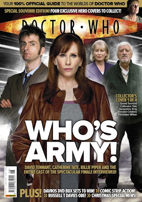
The title of the publication for this magazine is 'DOCTOR WHO magazine'. The type font for the title is big and bold. The logo of the magazine is BBC. Both texts are portrayed in the same colour making it stand out. The logo of the magazine is presented without colour, the text is more thin and in normal font whereas the 'DOCTOR WHO MAGAZINE' text is in bold and big making it stand out from the rest of the magazine. The title of publication is presented in a different colour to the other text in the magazine.
Slogan:
The short, catchy statement used in the magazine to sum up the magazines image and stick there reader's mind is 'The Doctor's past come back to haunt him...' This creates suspense to the audience with the use of ellipses. The statement used in the magazine creates a sense of suspense as well as mystery as it leaves the audience baffled. It makes the reader question themselves about the show as it leaves the audience with a catchy statement making them want to watch it.
Central image
The central imagine of the magazine is three characters. However, the main character is presented in front of the other two characters signifying that the central character presented in the magazine is the protagonist. The direct contact of all characters in the central image shows that all there's a mystery behind them, as their facial expressions show the power in the characters. Another thing to point out from the magazine is the fact that there is different lighting used for the portrayal of characters. For example, the magazine portrays the protagonist in low key lighting and the other two characters behind him, there is high key lighting used. This signifies the importance and the mystery behind the protagonist.
‘Flash’ / Cover Line / Sell Line
Around the image, the text placed around it states 'celebrating 50 years of adventures in space and time' and Matt Smith and David Tennany exclusively chat to DWM about the biggest TV event in the history of the universe. 'The day of the doctor' and the 'The doctors past comes back to haunt him...' All these cover lines and phrases make the magazine create
Free offer
The offer presented in this magazine is ' WIN blue rays, DVDs, books and CDs' this is targeted to the magazines core audience as the 'WIN' is associated with 'DOCTOR WHO' the win is also presented with pictures of what they audience will win making them more interested in buying the magazine. Another way the win catches the audiences attention is the fact that WIN in written in bold handwriting, it is presented in red and white making it stand out from the rest of the text. The win is also presented right near the picture of what the audience will win making their attention go on the product as soon as they start viewing the right hand side of the magazine.
Colour scheme
The colour scheme enhances the mood or particular vibe of the magazine, the colour of the magazine cover page has a a huge impact on how captivated the audience is. In this edition of 'Doctor Who' the colour scheme consists of greys, whites, reds and blacks. These colours create a mysterious sense about the film itself.
Name checks
There are two main name checks used; David Tennant and Matt Smith who are the main characters of the show so offering a interview with them will grab a buyers attention as they are more likely to buy the magazine if they get to know more about their favourite characters.
Language
The language used is snappy and no unnecessary words are used. Lots of poetic techniques are used such as - puns, alliteration. The aim is to grab the audience's attention as fast as possible. The words on the front cover are fairly formal "exclusively" which are mainly to target the older audience. However scientific phrases are also used to target a different audience "space and time".
Competitions
The opportunity of winning prizes are a further way of compelling the reader. Quizzes and and questionaires also draw the reader in to help them feel part of the publication as they're interactively involved meaning they're more likely to be interested in the magazine. Competitions make the reader want to buy the magazine as they believe they have a chance in winning something good.
Direct Address & Asking Questions
Direct addressing in this front cover is consisted within the cover line. The word 'celebrating' makes the audience feel as if they are part of the event which is the doctor who edition. This makes the loyal fans feel part of the family they always wanted to belong to.
Bar code, date and price
The bar code situated on the bottom left of the cover indicates validity and the magazine is a free issue therefore there is no price written on it. The date isn't written on it as it is a free issue so there is no need to keep up with when it will be released.
The real target audience
The real target audience for Doctor who would probably be those ages from age 14-25 as it has a sci-fi element to it and the younger generation tend to be interested in this genre. It is aimed at people in the ABC1 demographic group as it uses complex language in it's magazine. The psychographics group this magazine would attract would be explorers and reformers as both groups are interested in the adventerous side of life and socialisation of humanity.

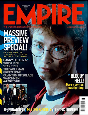
'HARRY COMES OUT FIGHTING'

'VOGUE FOR HORROR EAMS'

'SUICIDE IS NOT AN OPTION'

'THE TRUTH HURTS'

'THE 50 GREATEST HIP HOP SONGS'
3)


No comments:
Post a Comment